Monday, November 12, 2012

rietveld-schroderhuis


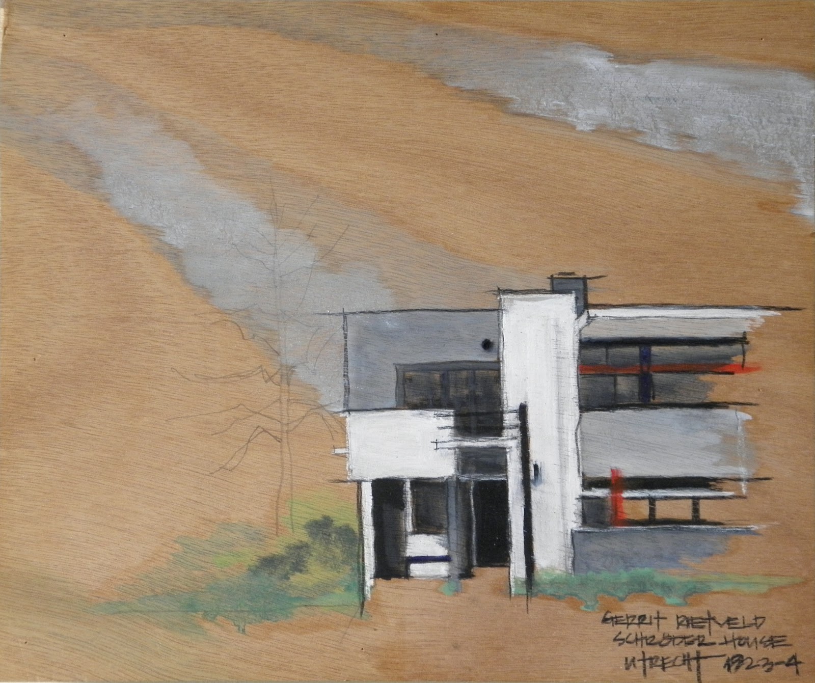
oil and pencil on beechwood panel [35 x 28cm]


The Rietveld-Schroder House in Utrecht has been on my must-journey-to list of architectural pilgrimages and I finally had the chance to slot it in during this trip to Holland...
Anyone remotely cognizant of the history of design will have seen an image of this seminal house published somewhere in design journals and books over the years - it being the poster domus for the architectural manifestation of the early modernistic movement according to the influential dutch De Stijl principles.
Built in 1924, almost a century ago now, it looks as fresh and innovative as it did when it jigsawed up at the end of a row of traditional dutch houses backing onto misty farmers' fields.
The story behind its conception and realization is the story of a man and a woman collaborating pragmatically [as the dutch are prone to do!] on a project that suited both their temperaments and talents satisfactorily.
The architect Gerrit Rietveld (1888-1964) had been designing furniture [most well-known is his Red and Blue Chair, 1917] before this first commission for a house from a determined widower, Truus Schroder-Schrader, who envisioned an unconventional setting to bring up her young family in.


oil and pencil on beechwood panel [30x25cm]

The rhythmic collage of vertical and horizontal planes in white and grays and punctuated by strips of black and primary colours on the asymmetrical exteriors are reminiscent of Piet Mondrian's geometrical paintings of the same period...[Mondrian being another important figure in the De Stijl artist group] - and it remains one of the most visually arresting buildings from this era...


oil and pencil on beechwood panel [30x25cm]

The highlight for us was, of course, a tour of the interior [which had been arranged by appointment months ahead!]  We donned vinyl covers over our shoes before entering and were  guided, then partly left alone when a group of students came in shortly after us. I respected the no photographing request by the guide - although I had many chances to cop a shot when she was tending to the students!
The detailing and built features within the house are a revelation of the experimental results and ingenious adaptations of the two collaborators - the application of Rietveld's integrative [and often playful] ideas and Schroder-Schrader's concept of living "consciously and actively", of creating participatory spaces that can be opened or closed, that flow in and out, that are multi-functional and solitary.
Floor to ceiling door panels to close off bedrooms slide open completely to enlarge spaces on the upper floor; furniture were built-in and affixed in certain spots; wood shutters to cover the large windows can be cumbersome and somewhat awkward to put in place; small balconies protrude from every "room" to step out for fresh air; and then there are the small charming attention to privacy and personal space, such as individual cubbyholes for the mail of each occupant and the clearly marked "intercom" system for deliverers of grocery...

A prominently lettered designation for delivery persons ["boodschappen" = grocery] to communicate with the inhabitants within - there is a mouthpiece [="spreekbuis" sign under the grey square patch with round opening to speak into] that is connected to a "hose" inside extending to the upper level to announce themselves and receive attention.

Only Rietveld could design a one-legged bench that is as simplistically functional and elegantly provocative as this...

Both Rietveld and Schroder-Schrader lived out their years in this house,evolving the spaces according to their needs and changing circumstances. Rietveld died here in 1964, and his patroness and housemate some 20 years later in 1985.
It is always somewhat disconcerting and altogether poignant to be actually within the space of such an intimate house, albeit a most famous one - to circulate and touch the materials and objects, to sense the energy that created every aspect of it, to know a little of the lives that once moved about, to follow the northern light that falls upon the painted surfaces...


Since 2000, the Rietveld-Schroder House has been preserved  as a UNESCO World Heritage Site :: "an icon of the Modern Movement in architecture and an outstanding expression of human creative genius in its purity of ideas and concepts as developed by the De Stijl movement. With its radical approach to design and the use of space, the Rietveld-Schroderhuis occupies a seminal position in the development of architecture in the modern age."

[The house has been fully restored to its original configuration and is maintained by the Centraal Museum in Utrecht.
Reservations required for visits.]

RIETVELD-SCHRODERHUIS
Prins Hendriklaan 50
Utrecht, the Netherlands

[The three paintings above can also be seen on my painting site:: ginaverster.blogspot.com]


Friday, August 31, 2012

het schip


On an overcast morning that promised rain, we were determined to find Het Schip before being drenched.  We kept on walking, got lost, and finally had to ask for help from various passersby, only getting the right direction from a bike store owner...
Het Schip is one of three monumental public housing blocks in the Spaarndammerplantsoen [park] designed by Michel de Klerk, perhaps the most well-known of the architects from the Amsterdam School, an artistic movement founded in 1915 that encompassed all the design and decorative arts and especially a more expressionistic and creative architectural style.
This complex with the post office corner that resembles the prow of a ship, hence the name, was completed in 1921and is wedge-shaped in layout thereby bounding a large triangular courtyard.  It was originally comprised of 102 residences for labourers, a school [that was already there and had to be carefully integrated into the block], an assembly room and a post office [which is now a museum].
Het Schip is distinguished by the innovative use of bricks, tiles, the many charming sculptural ornamentation by Hildo Krop, imaginative window designs, and even the typography is exclusively Amsterdam School.


Wednesday, August 8, 2012

amsterdam slokje


Amsterdam never fails to instil a sense of home, a very delightful sense in fact - and we always look forward to a return... sadly, the grand canal house above [the largest of them on the Amstel Canal] is no longer in the family and we are relegated to stay in a more modest one around the corner on the Prinsengracht [the most lovely Hotel Orlando , below]


*****

this gracious hallway in another canal house leads into FOAM - Fotografiemuseum - where we wandered around stately rooms full of contemporary and innovative dutch photo-art...


*****

ever exhilarated by progressive dutch creativity, we tumbled into the moooi wonderland of design delirium with gravity defying artwork to precariously perched furniture to glowing protonic doorknobs to ethereal floating light spheres...


*****

taste sensations are more traditional, ranging from the elegant street fish stands for a raw herring power snack any time of day to hourly marathon of dim sum in Chinatown to stacked to the attic purveyors of great wheels of cheese to precious patisseries presented like bejewelled baubles in spotlit glass cases...


*****

dropped dutch diction...

determined dutch-chinese...
[like our mooi kroost!]


Monday, July 9, 2012

scandi-design::stockholm

Stockholm coolly emanates a dual personae of contrasting ages and stylistic manifestations that fluxes constantly from one to the other - resulting in redoubly pleasurable experiences...
as we hobbled along the cobbliest medieval street ever on Sodermalm to the realization that the smoothest rock in our bathroom sink at the Hotel Skeppsholmen must have been cinderella-ed over and elevated to high design status...


*****

from the gustavian nook in the 18th century mansion converted recently into the Hotel Hellstens Malmgard where the blood red walls of our room hosted a life size portrait of a lovely swedish queen whose royal spectre hovered benignly around all night...
to the artsy installations of the latest designer pieces in the anterooms of the Hotel Skeppsholmen where, in the dappled twilight, the ghosts of naval officers past boldly followed guests to their rooms...


*****

at the Moderna Museet, an older wing with small windows had oddly angled yet innovative metalplate shutters affixed to the brick wall for partially shielding from the blinding light of summer and the blowing snow of winter, perhaps...
and a short walk away near the waterfront, stands a most distinguished WC - faced in marble and with a bronze door handle, it evokes a mildly ghoulish mausoleum more than a contemporary public facility...


*****

from the barest of simple white bulbs on the most traditional oxblood stained batten board wall of an older dwelling...
to the gravity defying lamps in the window of a latest to the minute design shop...


*****

from the zen white on white on white of a single sprig of cotton buds in a ceramic twig wall vase...
to the elegant exuberance of a two-pink-toned spray of heather in a raw concrete planter,
the Swedes delight in their design sense like nobody's business [and hence everyman/woman/child's compulsion to the democratic aesthetic of IKEA the world over!]


*****

royal sardines and lusty tea for our culinary indulgence...


Monday, June 25, 2012

scandi-design::copenhagen


 Design Museum Danmark / Kunstindustrimuseet:: a reflection of the facade is woven into the carpet covering the courtyard leading up to the main entrance...
[the museum shop features the coolest selection of designy stuff and the museum cafe serves the most delectable hot cocoa!]


 *****

 the royal city of divine as well as mere mortal powered wheels in two of their many design permutations...


 *****

 from the venerable Georg Jensen flagship and the illustrious Royal Copenhagen store and museum next door to the luminous Designer Zoo with the largest collection of contemporary Danish craft and design, my attention was more often riveted by the ever happy and superbly designed danish men walking by with their bikes...


 *****

 from an elegantly simple yet visually arresting modification of balconies on this older apartment building [designer unknown] to the most slicing dicing edge designs from Copenhagen's sizzling hot architect Bjarke Ingels
this is my kind of can't-stop-licking ice cream town where the architectural offerings are truly deliciously frozen music...


 *****

 the charmingly thoughtful stair design for the lucky ducks to climb decorously out of their pond in the courtyard of the Royal Library and the lovely art nouveau-esque curved stone steps for those needing to find the discreet lavatories within...


*****

and on one of the oldest buildings in Copenhagen, the Old Stock Exchange built in the first half of the 17th century, is a coiling spire of the twisted together tails of four dragons symbolizing the union of the Nordic countries and manifesting an altogether uniquely royal danish design [by King Christian IV himself no less] atop a Dutch Renaissance inspired building...